

%2520copy%2520(3).avif)

As an analytics engineer, I am always staying up-to-date with the latest and greatest in the data world. I am also always looking for events and workshops to attend where I can learn more about what other companies and teams are doing with their modern data stack. I recently came across Entropy - a data observability conference hosted by Sifflet. This conference highlighted some of data’s smartest leaders, discussing topics like data mesh, data lineage, sources of truth, and testing. It’s safe to say I will be further researching these topics to further increase my knowledge and improve my work. While I knew Sifflet was a data observability platform, I had never seen the actual product and all of its unique features. Luckily, at the conference, we all got a demo from the Chief Product Officer, Wissem Fathallah.
What is Sifflet?
Sifflet is a data observability platform that highlights data quality, traceability, and visibility. It ensures you are preventing fires rather than fighting them. Sifflet creates actionable insights on your data so that you can act on any potential problems before they begin to affect the quality of your data as a whole.
A solution like Sifflet enables you to unlock full data stack observability through extensive Field Level Lineage across your entire data pipeline - from ingestion to BI - also allowing you to fully automate your Data Quality Monitoring workflow.
What makes Sifflet different from any other platform?
Sifflet has a few different features which stand out from any other data observability platform. They really focus on the small details in your data that make observing data both at rest and in motion seamless and stress-free.
First, they make it so monitoring can be set up in a matter of minutes rather than weeks. Second, the way they organize your data lineage is clear, concise, and easy to read. Third, they have a visual interface that allows you to closely track your data volume. This feature is extremely important to me after dealing with undetected data loss a few weeks ago. Lastly, Sifflet organizes your data assets in a way anyone within the business can safely use.
Let’s dig deeper into each of these unique features of Sifflet.
Monitoring in a matter of minutes.
Sifflet is a perfect tool for those that don’t have the time or resources to spend weeks getting their data connected to an observability platform. Who has time for that anyway? When you have a lot of awesome data to gain insights from, you want to use it as fast as possible. And have extreme confidence in it!
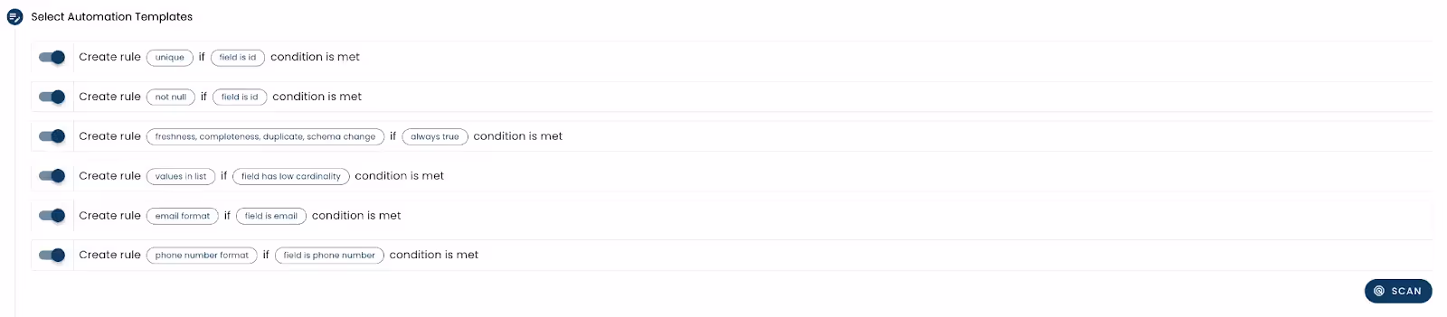
Sifflet’s auto-coverage feature takes the guesswork out of monitoring your data. They use machine learning to identify and suggest fields within your data assets that should be used for monitoring. Through auto-coverage, you can also apply various automation templates or rules. These include common data quality checks like freshness, uniqueness, and null values.
Detailed data lineage
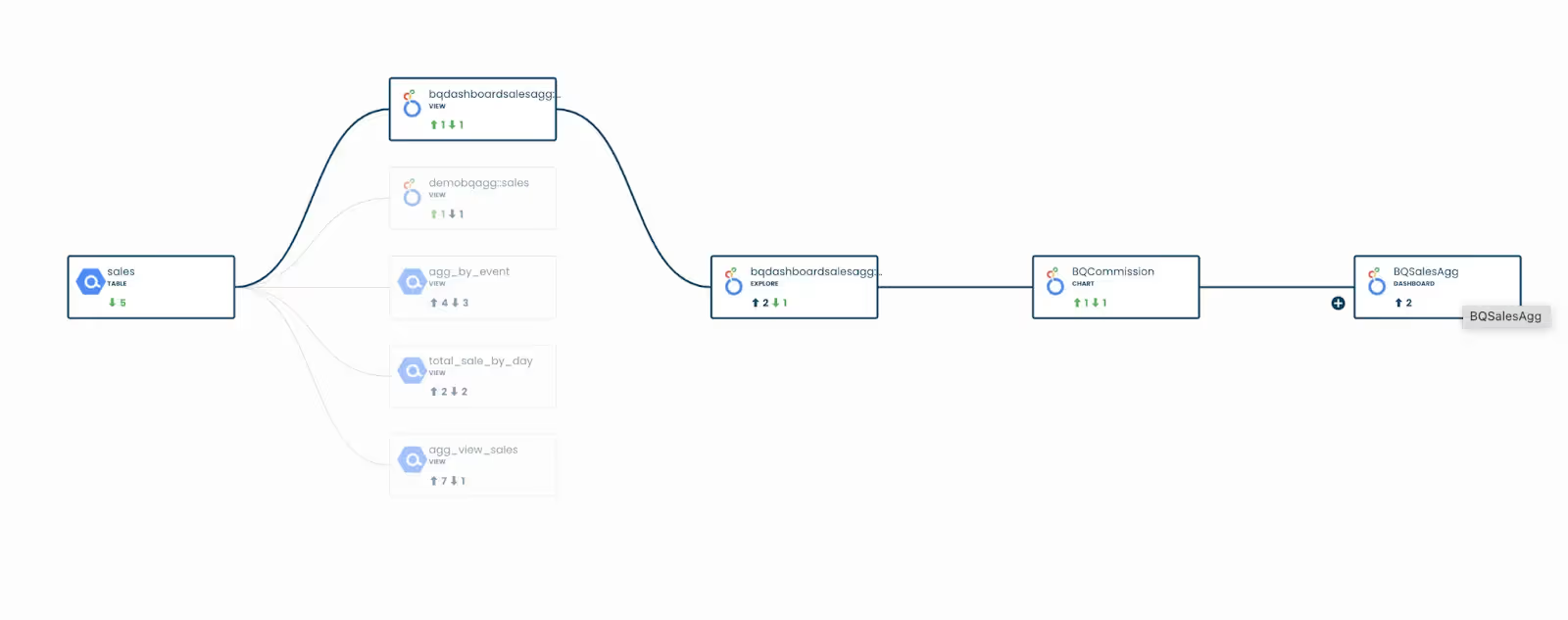
This may just be my favorite feature of Sifflet. There are too many times when I’ve gone to change the name of a downstream column to match my style guide only to find that there are upstream dependencies. I then have to do investigative work, parsing through all my models, to see which depends on that column. Luckily, with Sifflet, you can see table AND field dependencies.
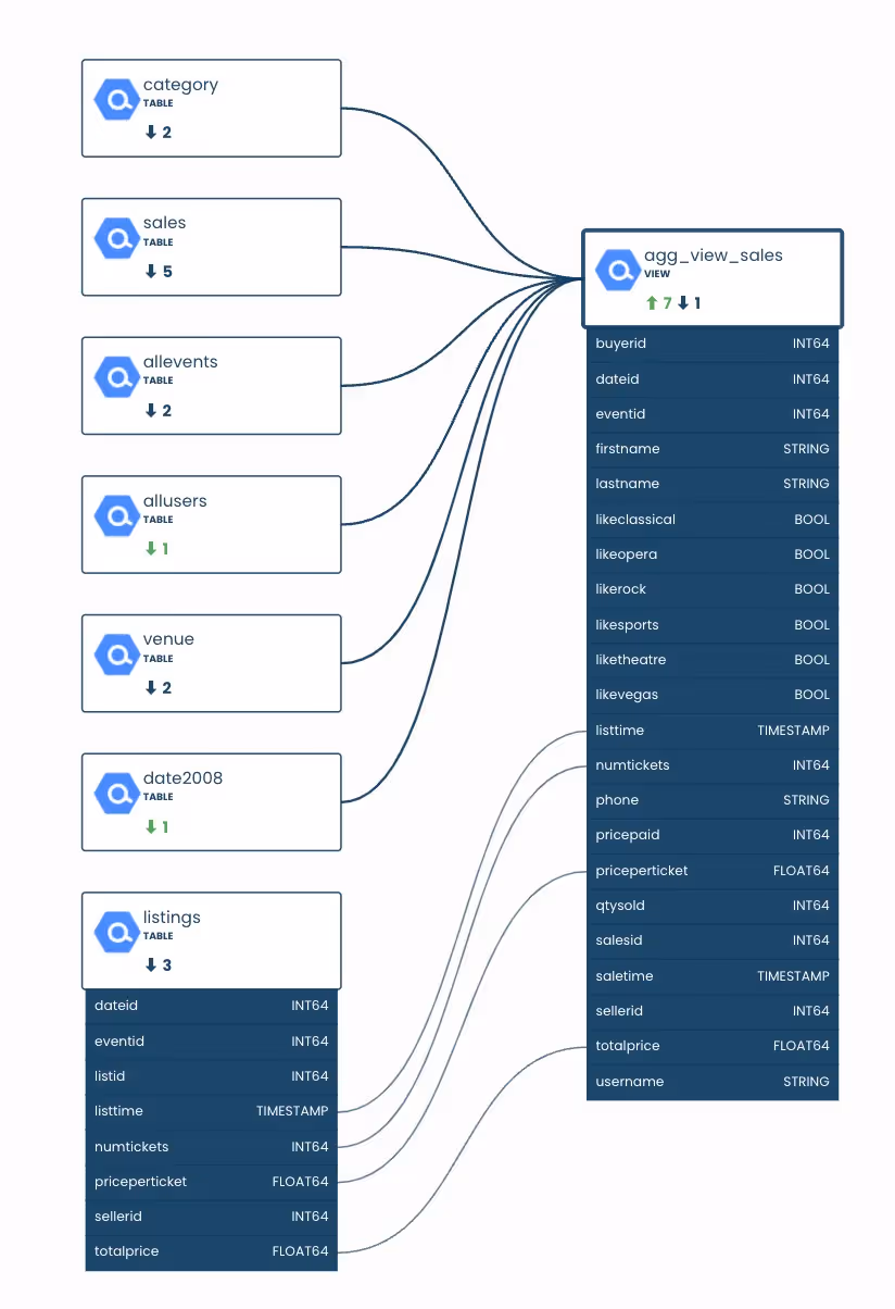
Sifflet allows you to follow your data tables upstream or downstream and expand the lineage to see each table and field name. As you see above, it draws a line between the fields of each table so you know exactly where a field is coming from. Eventually, you will be able to see the SQL behind each transformation, adding more transparency to your data models. But, that is an upcoming feature, so let’s keep that a secret for now. In addition, Sifflet shows lineage to the “right side of the data warehouse”, or your favorite data visualization tool. The platform is a full-stack data observability tool, so it shows you everything that touches your data. I know the data analysts and business users on my team would find this super helpful.
Visual data volume tracking
As I mentioned earlier, I’ve recently encountered a few week's worth of data loss because I was unaware that the volume of data being ingested into one of our tables had rapidly decreased. This isn’t a fun problem to have and one that needs to be avoided at all costs. I wish I had Sifflet’s product then. For each data asset, they have an awesome visual that shows how much data is being ingested each day. This gives you an idea of how your volume trends over time. You can easily see spikes and drops which also get detected by a machine learning model.
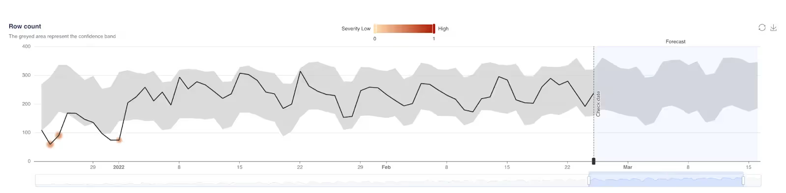
When the model detects these abnormalities on your data, you then have the ability to annotate it so the model can learn your data better. The options include a false negative, false positive, expected, fixed, and known error.
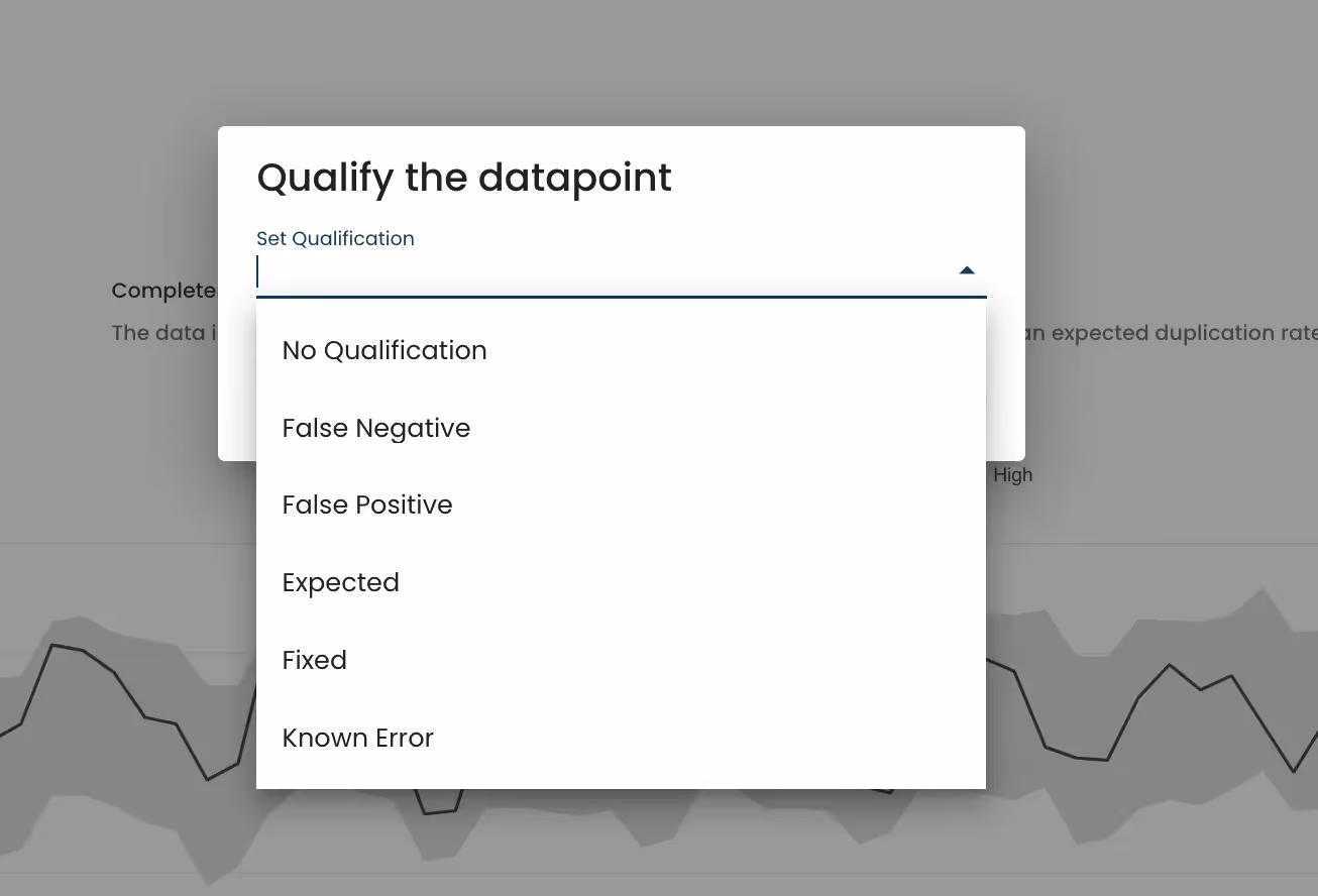
Labeling these will allow the model to get smarter and for you to spend less time on issues like this in the future. You can also assign criticality levels, tags, and Slack channels to these data discrepancies so you are properly notified each time this type of situation occurs.
Easy to use data assets
Lastly, Sifflet makes it easy to know which data assets are safe to use. This is extremely helpful for not only engineers and analysts, but business users. Within the platform there is a space for all of your data assets, making it easy to navigate to and find exactly what you need.
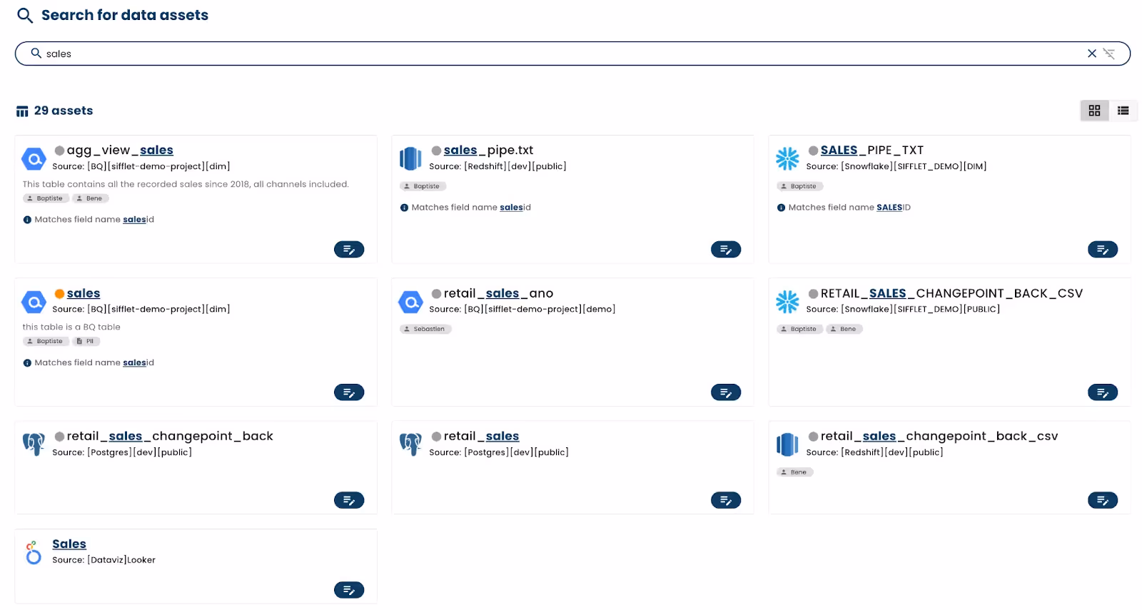
Each of these data assets has a few telling features which alert the user whether it is safe to use. Next to the data asset name is a dot. This dot is either red, green, or gray depending on its quality. A green dot means all of the asset’s rules are passing whereas red means they are failing. A gray dot indicates that the asset’s quality is not currently being monitored.
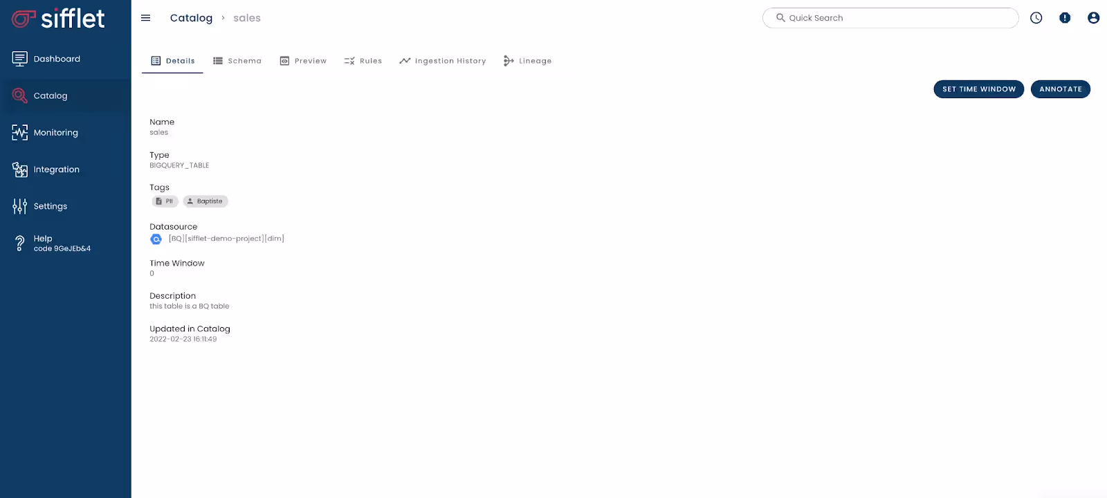
After clicking on a specific asset, you can see the rules you’ve set, the schema of your asset, ingestion history, and lineage.
Conclusion
Overall, I am super excited to see a product like Sifflet on the market. Data quality is a tricky problem to solve and they are doing it well. Gone are the days of spending weeks to set up a reliable platform only to still question the accuracy of it. Who wants to constantly be questioning if their data is reliable? Analytics engineers and analysts don’t have time for this!
Sifflet has many innovative features that sets it apart from the other data observability platforms on the market. Their detailed data lineage makes it easy to identify field and table level dependencies. Their data volume visuals allow you to easily pinpoint problems with ingestion and help the ML model grow smarter. Easy-to-read data asset statuses ensure you are only using the highest quality data. And, the best part, you can integrate it into your ecosystem right now and be using it by the end of the hour.
Get in touch for a demo or 15-day free trial contact@siffletdata.com


-p-500.png)
